Thursday Tip # 11 - Art and space - Hello ... welcome to our blog
Home Design And Decor what you're looking for information about Thursday Tip # 11 - Art and space yes if we have it available to you, we have also provided a lot of information about the design of the house which is very intersting to in view, ok please continue reading:
You can also see our article on:
Thursday Tip # 11 - Art and space
After a long hiatus I am back to Thursday Tips at the request of a reader who liked these short and to the point tips for "small improvements that have big impact". For this week my favourite topic - art.
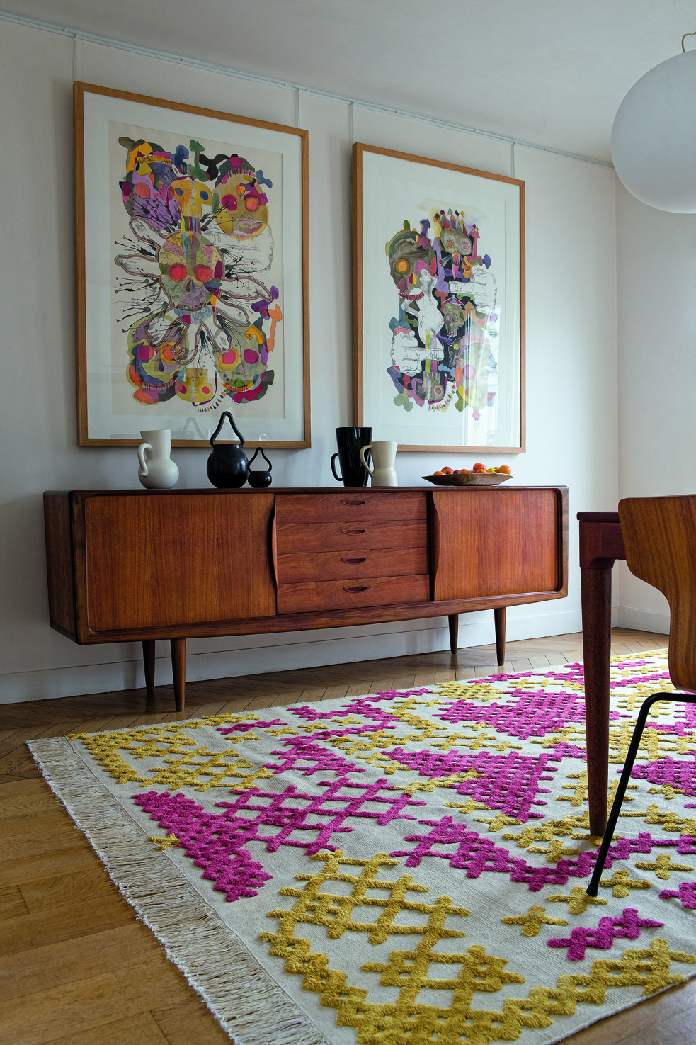
The biggest mistake made when hanging art is not matching the size/shape of the art work to the space you are hanging it. Work should look "comfortable" in its space not cramped or looking like it is awash in a sea of wall.
 |
| Layout follows vertical space |
 |
| Long console needs substantial work to fill space |
 |
| Perfect size and composition for top of stairs |
 |
| Size and shape works with width of headboard |
 |
| Art shape and size follows wall shape |
And there you have it. Large works for large spaces or smaller works massed together for impact. No little pieces lonely on a big wall. No large pieces squat into a small space. Oh, did I mention I have a lot of opinions on gallery walls? I'll save that for another tip.
so information about Thursday Tip # 11 - Art and space can we present to you, please reply pleased to share the link https://moxiemostudio.blogspot.com/2014/02/thursday-tip-11-art-and-space.html make it more useful for other people, you can also read other pages on this blog to increase knowledge about the design of the house is interesting, thank you


0 comments:
Post a Comment